regular architecture
Anything but the usual.
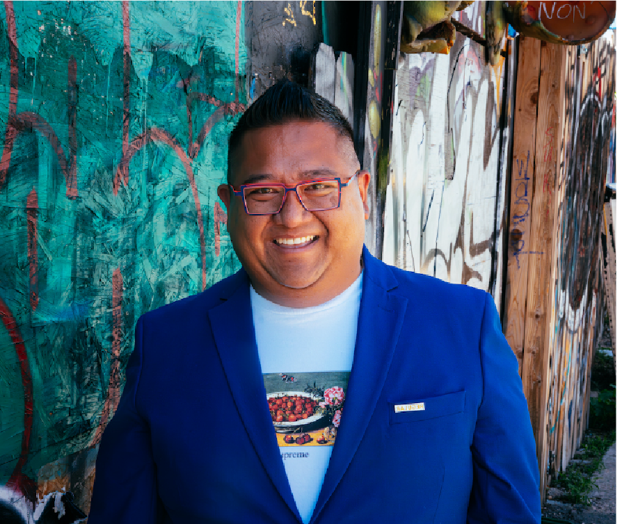
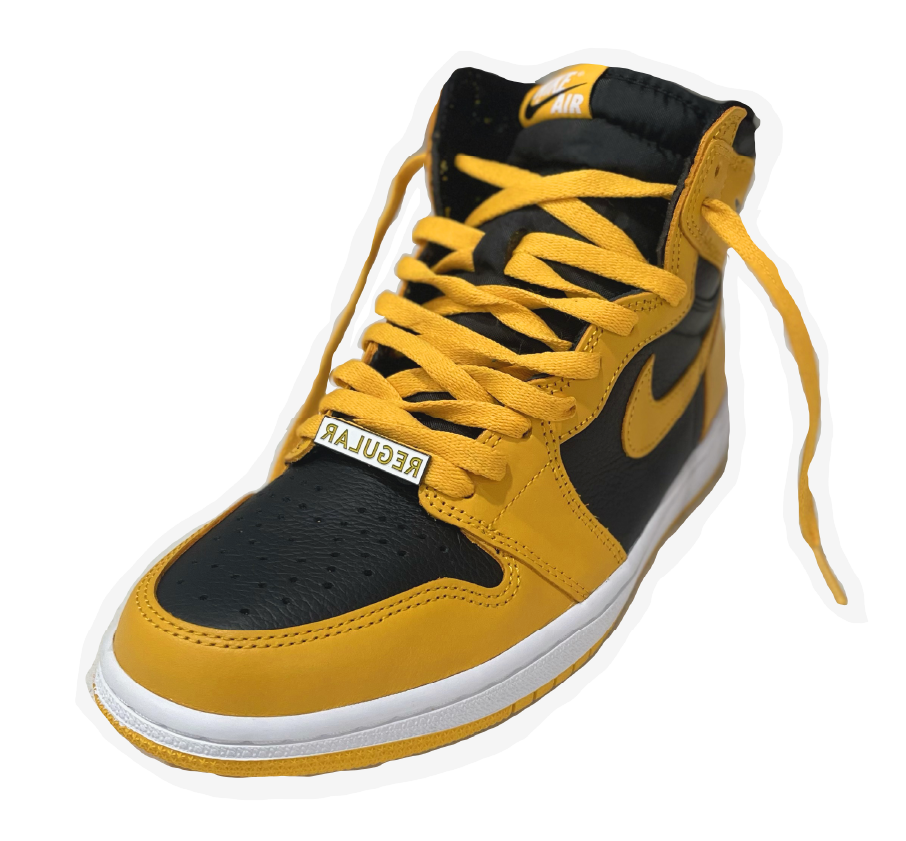
Kevin Nguyen, Denver-based architect, self-professed foodie, and AIA Colorado Young Architect of the Year (YAOTY) came to Paper Laundry for a brand that would capture his style and design philosophy. The name “Regular” was inspired by Kevin’s belief that high-end spaces should be accessible and comfortable places where customers become regulars. However, Kevin’s style is anything but basic, so we created a backwards logo to add in a little irregularity.
Regular shakes up the conventional Denver scene with a high-brow meets low-brow aesthetic, so we looked to the bold, simple, and versatile design of iconic streetwear brands like Supreme for inspiration. The Regular merch is especially covetable, just check out Kevin’s kicks! Throughout the brand, you’ll find repeating patterns made from the building blocks of the logo and design elements—which winks at the idea of customers returning again and again.
Kevin’s deep understanding of how kitchens and restaurants need to function allows him to create spaces that are both practical and beautiful. His roster of clients includes James Beard Foundation and MICHELIN Guide recognized restaurants such as Beckon and The Wolf’s Tailor (we’re a little biased towards their branding, too).
PROJECT
Brand Identity
Logo, Brand Marks, Illustration Palettes, Unique Patterns, Font Palette, Color Palette, Brand Language
Collateral
Swag Concepts
Apparel Concepts
A backwards logo shows off the name’s irony.

Inverting the way this business card design would typically use gloss further adds to the idea of disruption — irregularities and challenging the concept of the norm.


