The Lark — San Mateo
A garden that nurtures all.
This San Mateo community offers a retreat from the fast-paced professional side of life. Lush spaces were designed to create an environment to flourish and connect. With thoughtfully designed spaces, airy rooms, communal gardens, and even a rooftop bee colony, this zen residence needed branding that would make it sing.
PROJECT
Brand Identity
Logo, Brand Marks, Illustration Palettes, Unique Patterns, Font Palette, Color Palette, Brand Language
Interior Collaboration
Collateral
Apparel Concepts
Website Design Guide
Social Concepts
Swag Concepts
Partners + vendors
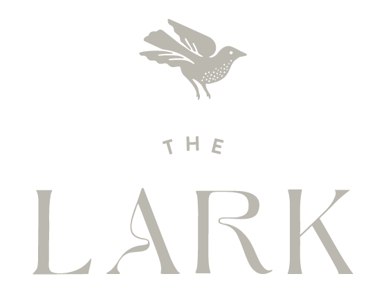
We chose the name “The Lark” to symbolize the open heart and spirit of this community. The bird features in the logo and gives a subtle nod to the greenery of the space. We kept the brand feeling clean and organic to represent the ease of life at The Lark.
Bird wings double as leaves to emphasize the connection to nature.
The newly remodeled property is breathtaking — a light, airy space delivering on the promise of respite. Spaces were created and brought to life by the incredible interiors designers and our collaborators, B2 Design Co.
Inspired by the Swedish idea of lagom, the ethos of “just right.”
Seeded paper can be planted for even more greenery.
Vellum enclosures and transparencies create a feeling of openness.


